An ode to NYC. The challenge was to create a brochure based on two popular fonts. The choice was to go with fonts that are both extremes to each other: the modern Helvetica and the elegant Bodoni. These scenes were created using Adobe InDesign, Adobe Illustrator, and mocked up and created in Adobe Dimension.
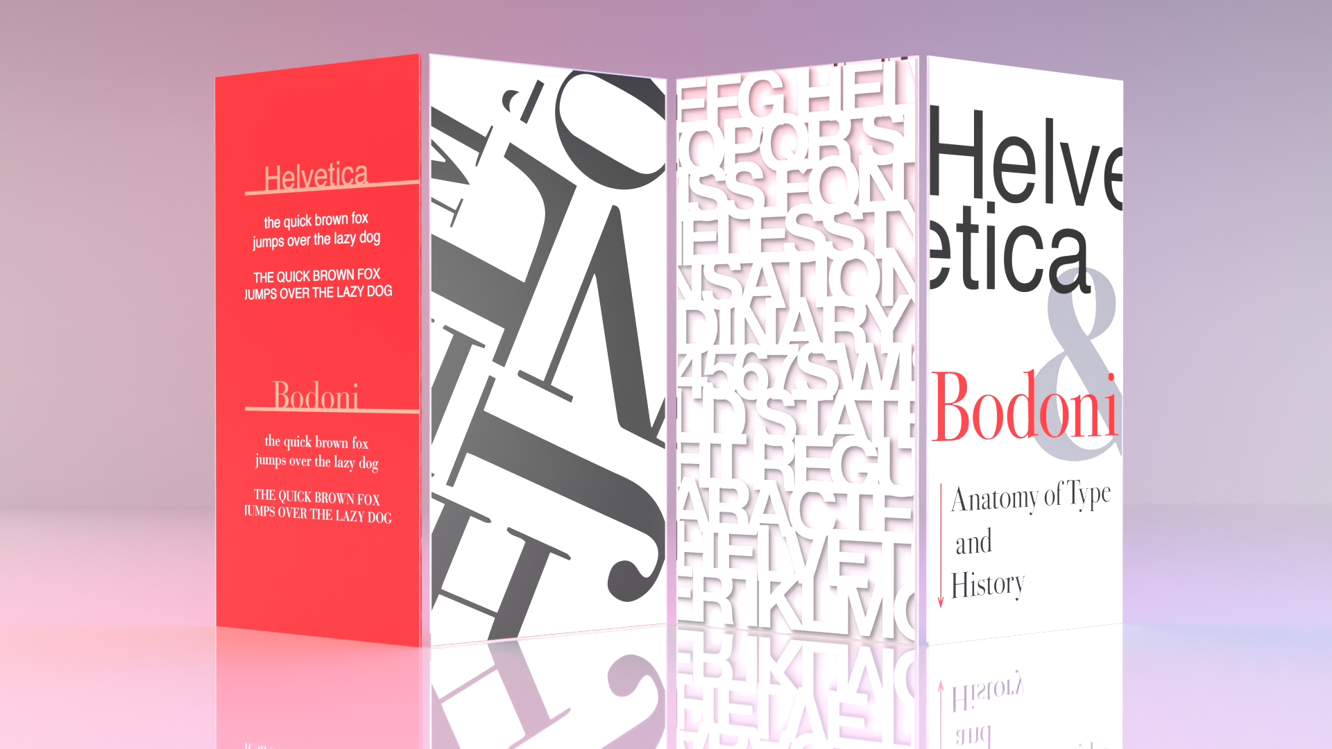
The basis and blocking of the layout is intended to create an organized space in order to show both sides of the coin and show how these fonts live in a metropolitan world.

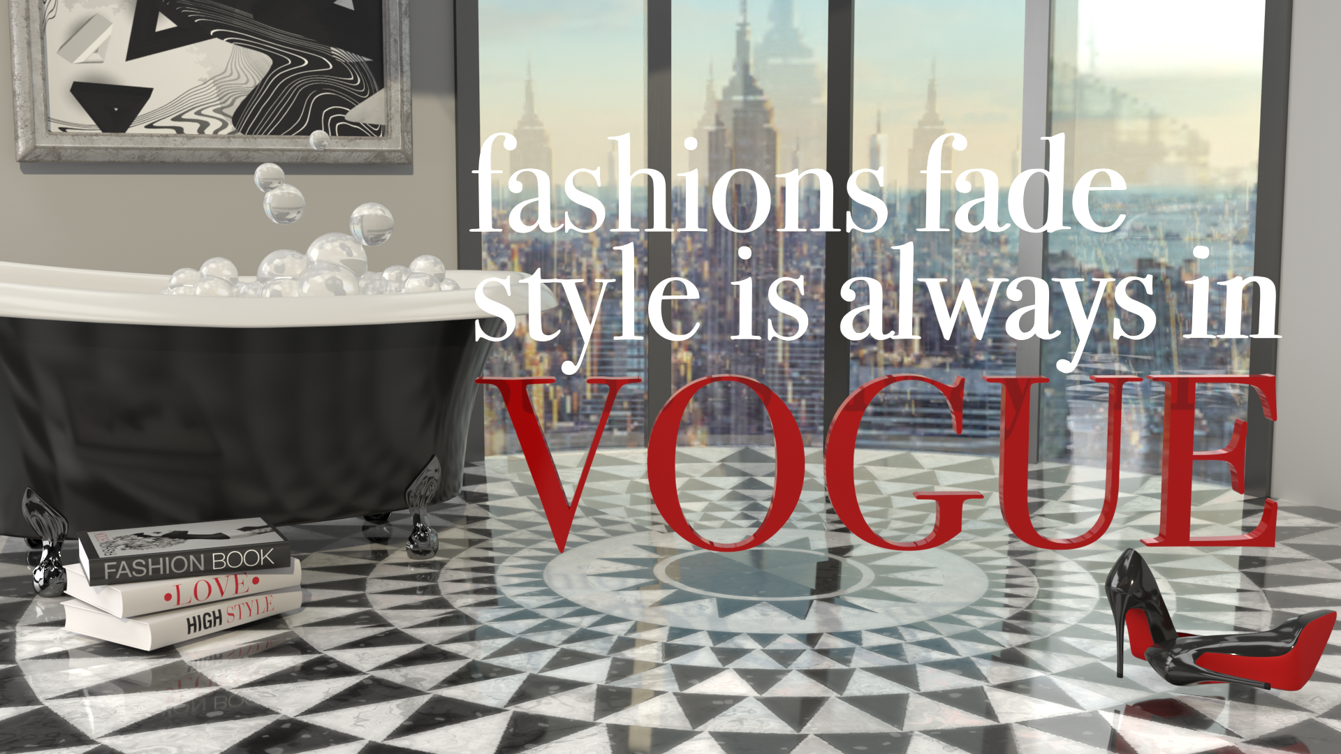
To further illustrate the beauty of the font Bodoni, I created an environment in 3D, from scratch, using Adobe Dimension. From the intricate floor tiles to the luxurious bubbles, what better way to showcase its use in luxury goods than to show it in a luxury penthouse overlooking New york City!
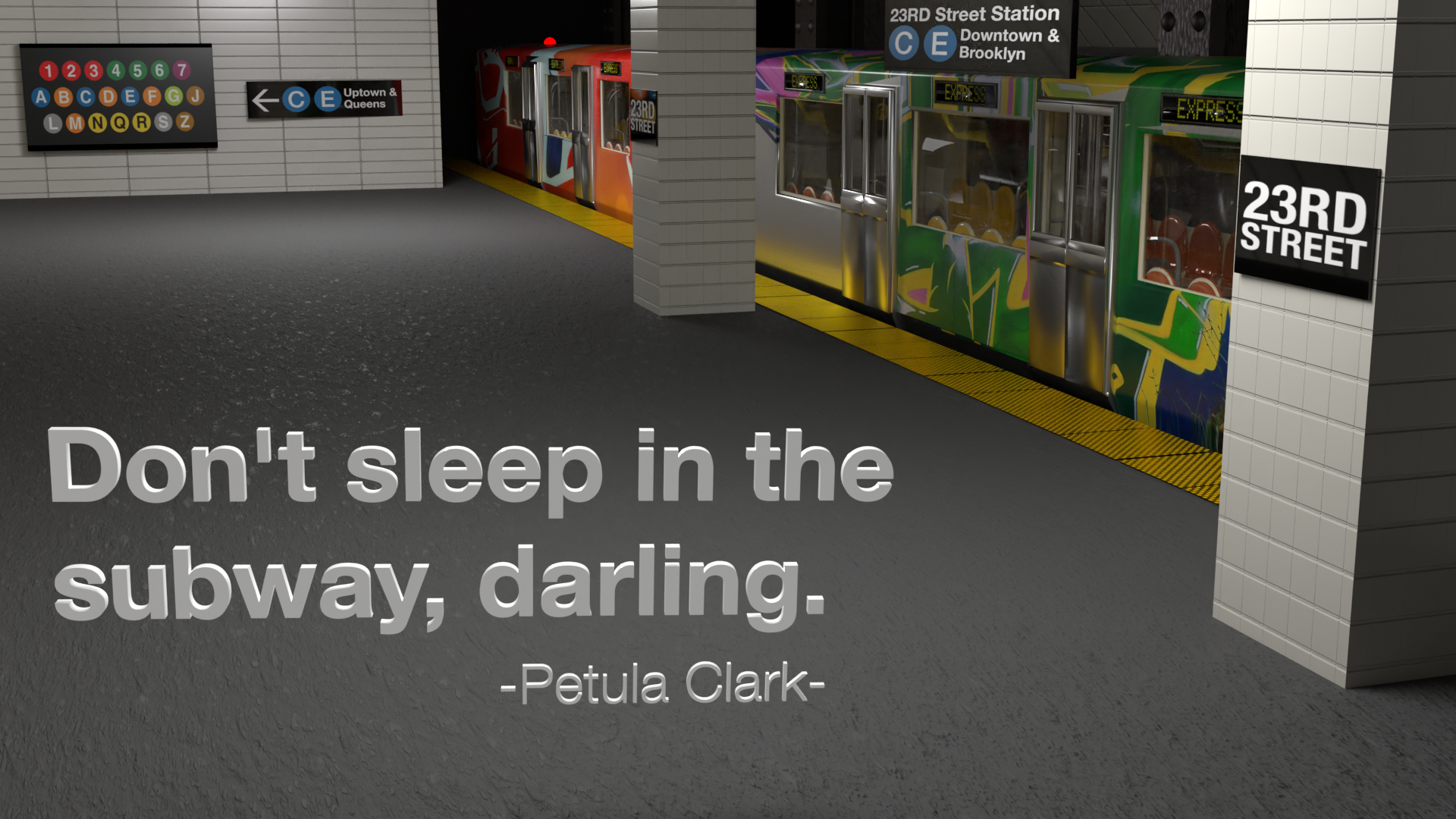
The New York City subway system uses Helvetica for all of its signage and wayfinding. Here the goal was to show the strength of the font, at different angles, to be easily readable at any distance while still remaining aesthetically pleasing. This subway scene, signs and lighting were created entirely in Adobe Illustrator and Adobe Dimension.